Mémoires d'Huron
public commission
signage
type design
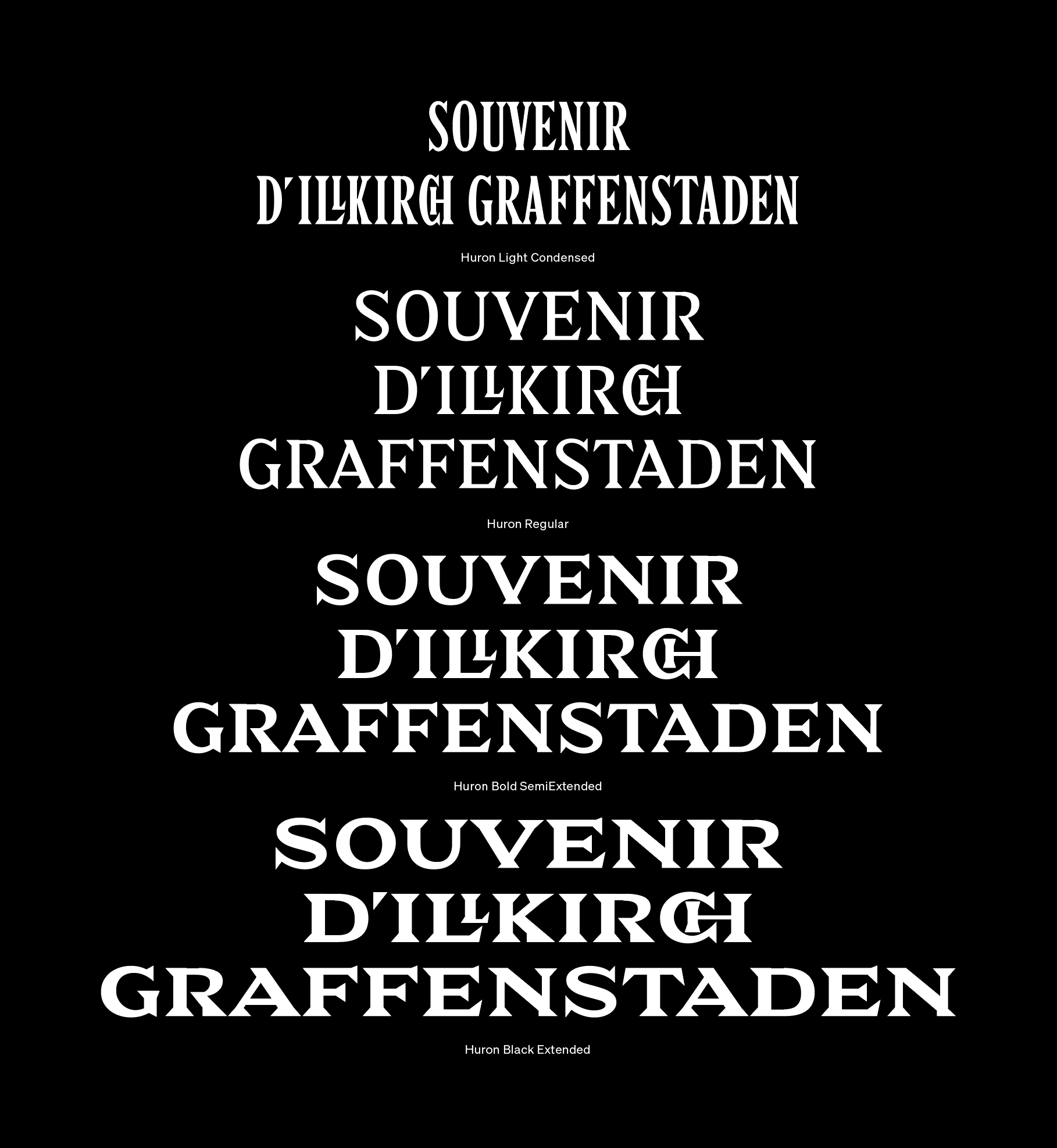
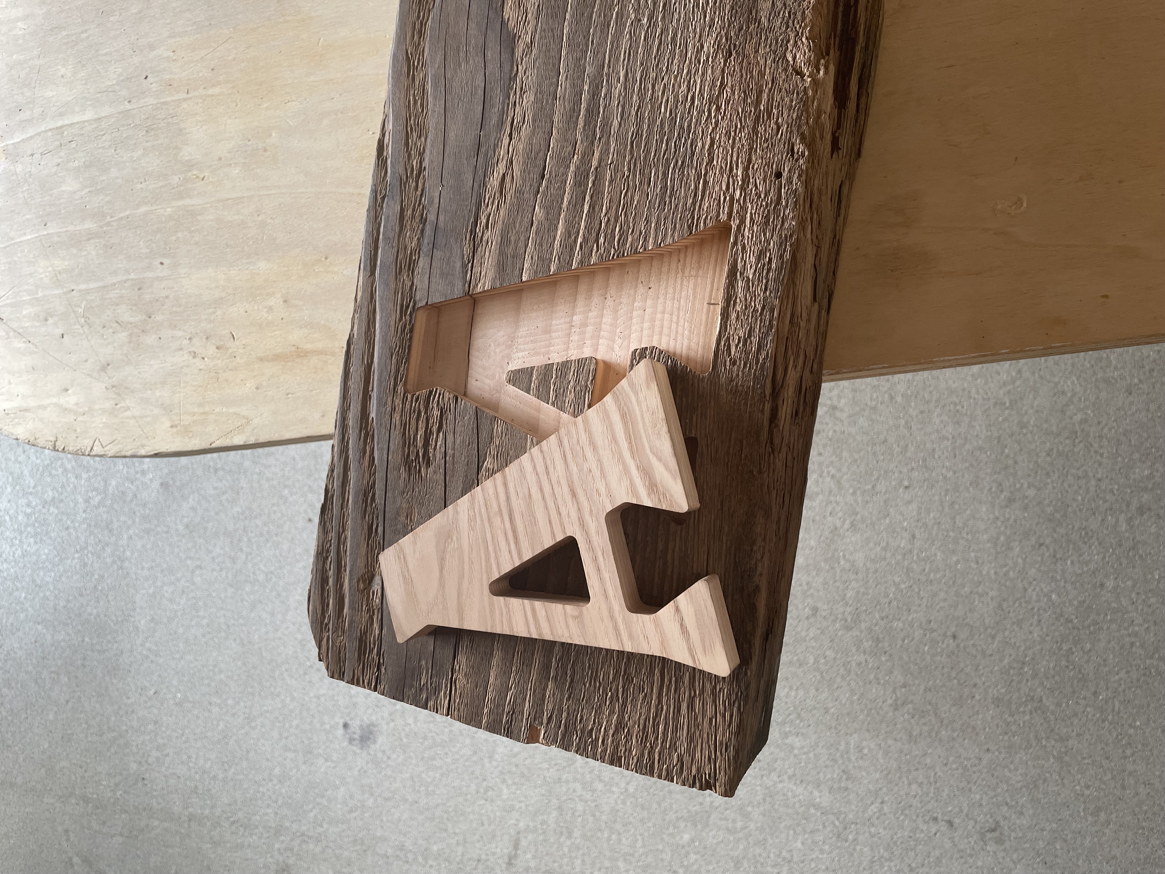
As recipients of a private/public commission within an urban development program in the city of Illkirch-Graffenstaden, we are designing the “Huron” custom type family in order to meticulously fashion and arrange an artistic installation — a poignant and poetic memorial signage.
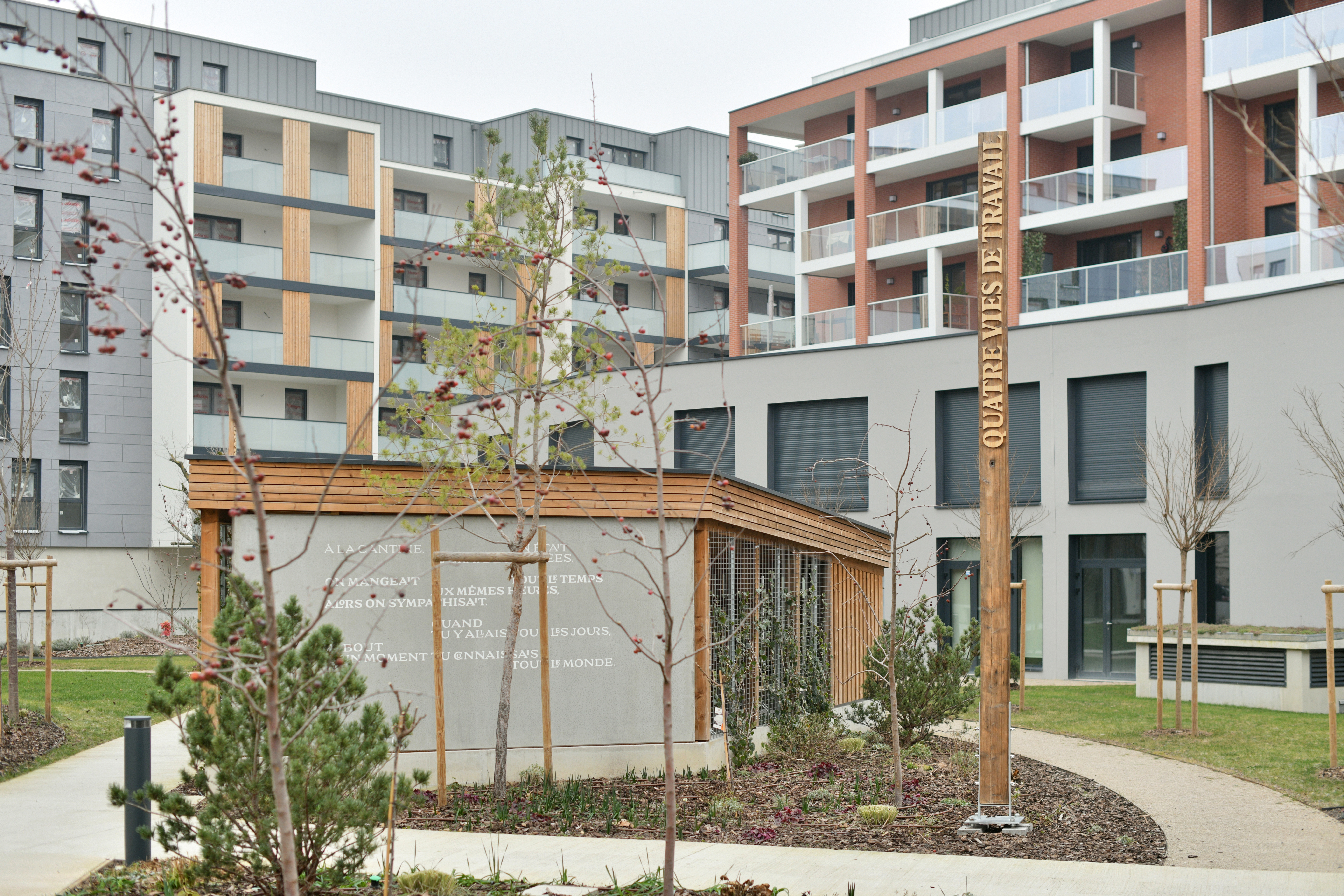
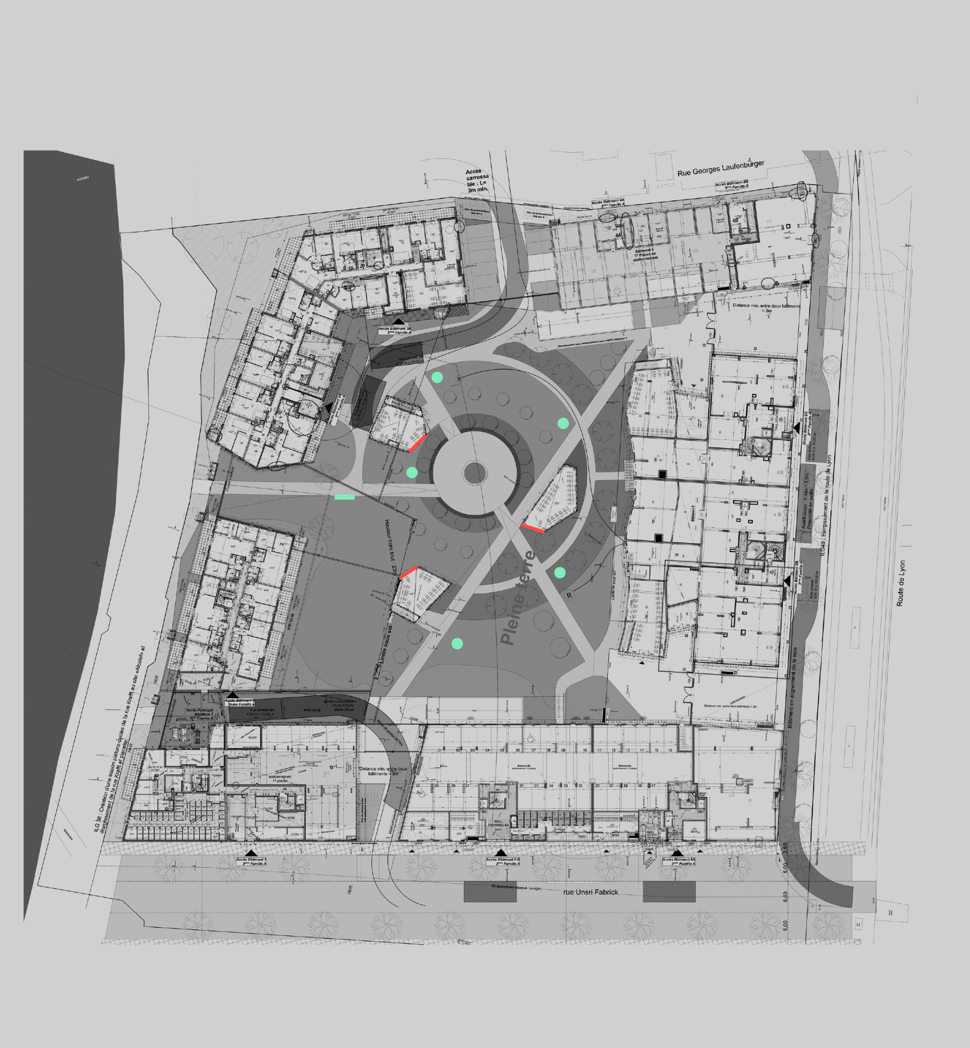
The Huron project unfolds within a park, nestled at the heart of a new real estate complex. Within this imposing architectural context, we conceive objects that seamlessly integrate with the surroundings, fostering a harmonious coexistence.
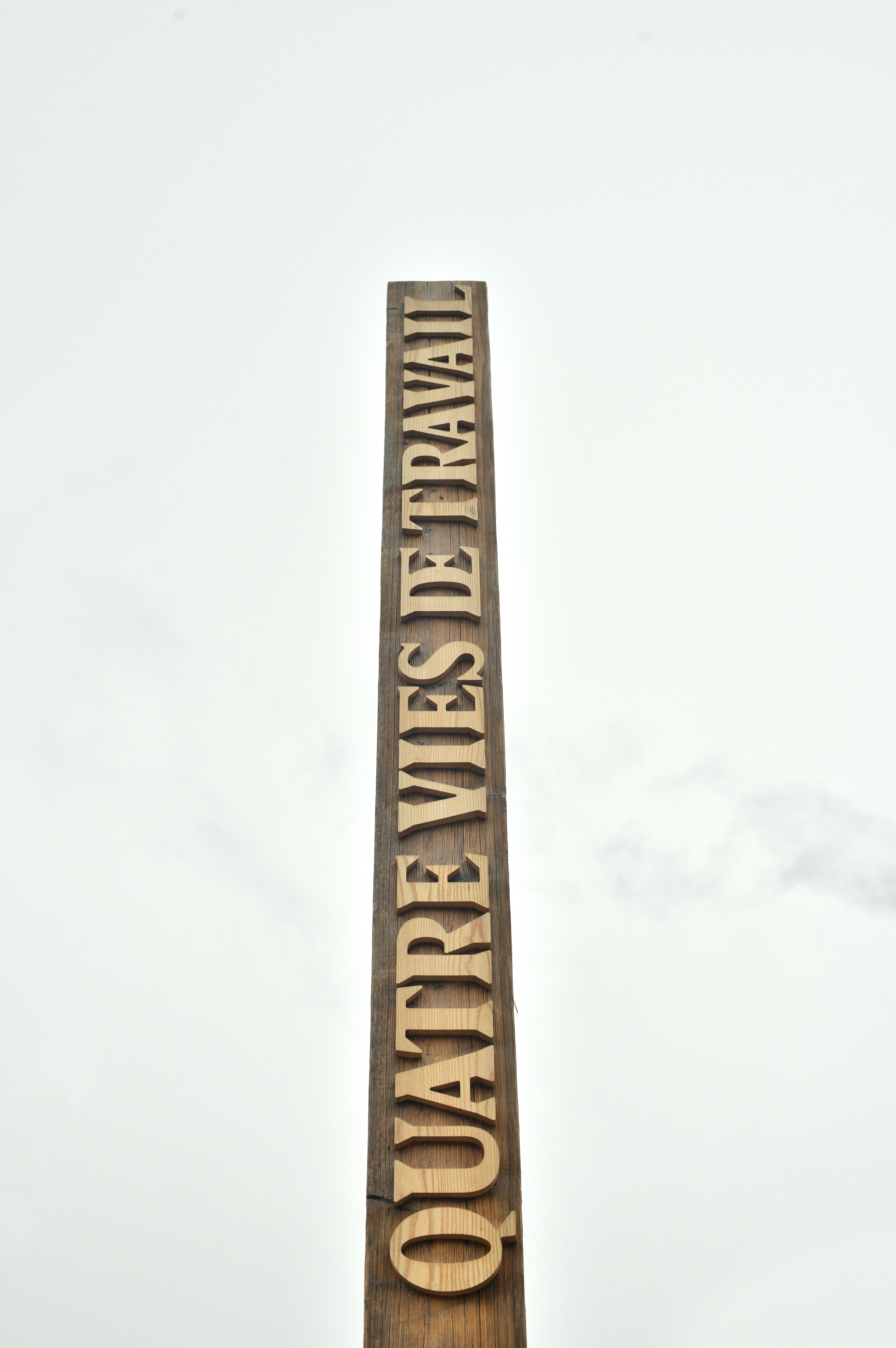
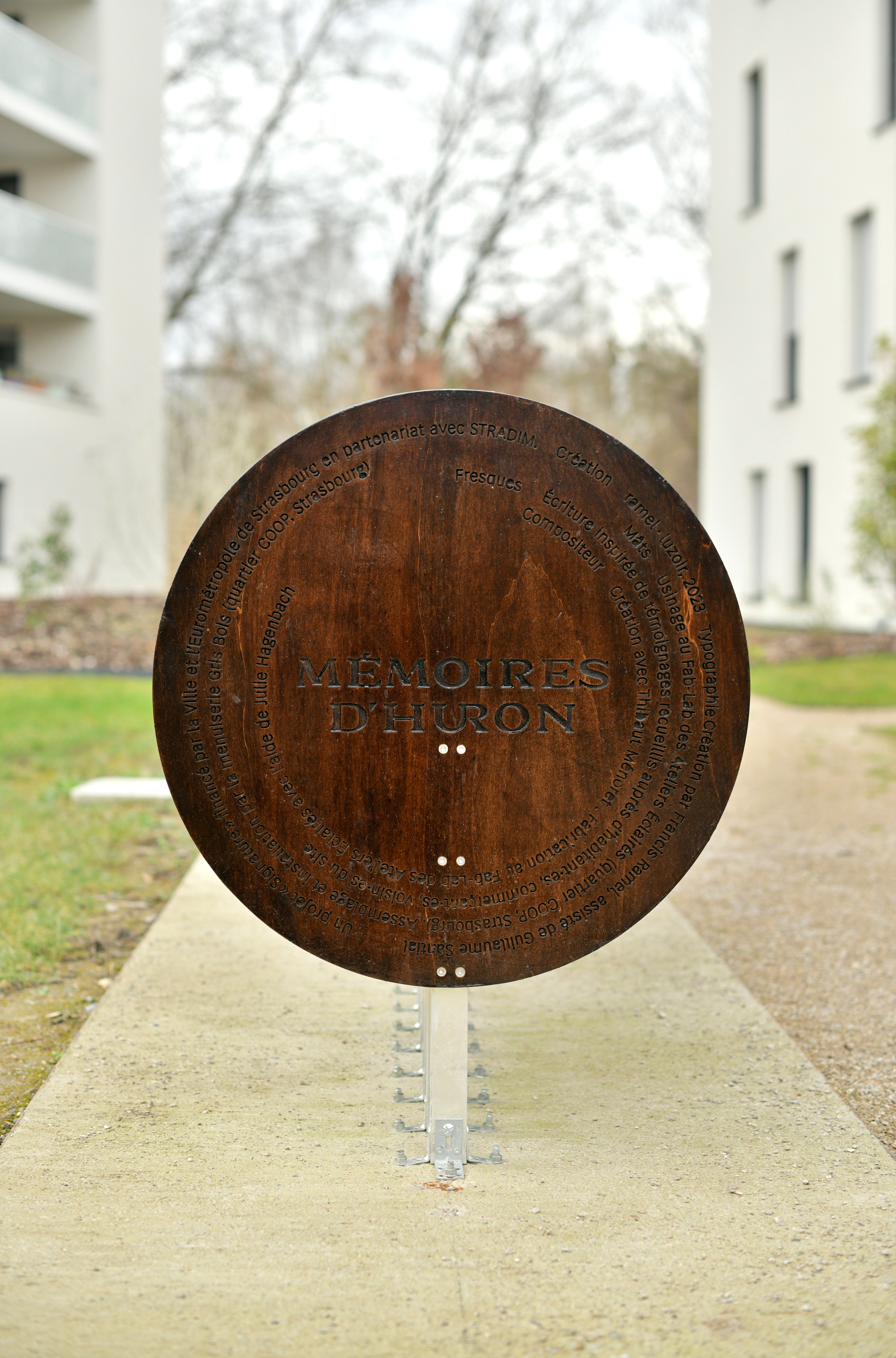
We conceive elegant wooden poles that gracefully ascend towards the sky, each bearing short texts at their apex—reminiscent of contemporary haikus. These poles serve as poignant reminders of the site's historical legacy, signifying their presence as a testament to Illkirch-Graffenstaden's illustrious past. They uphold the enduring connection between the enterprise and the park that now proudly bears its name.
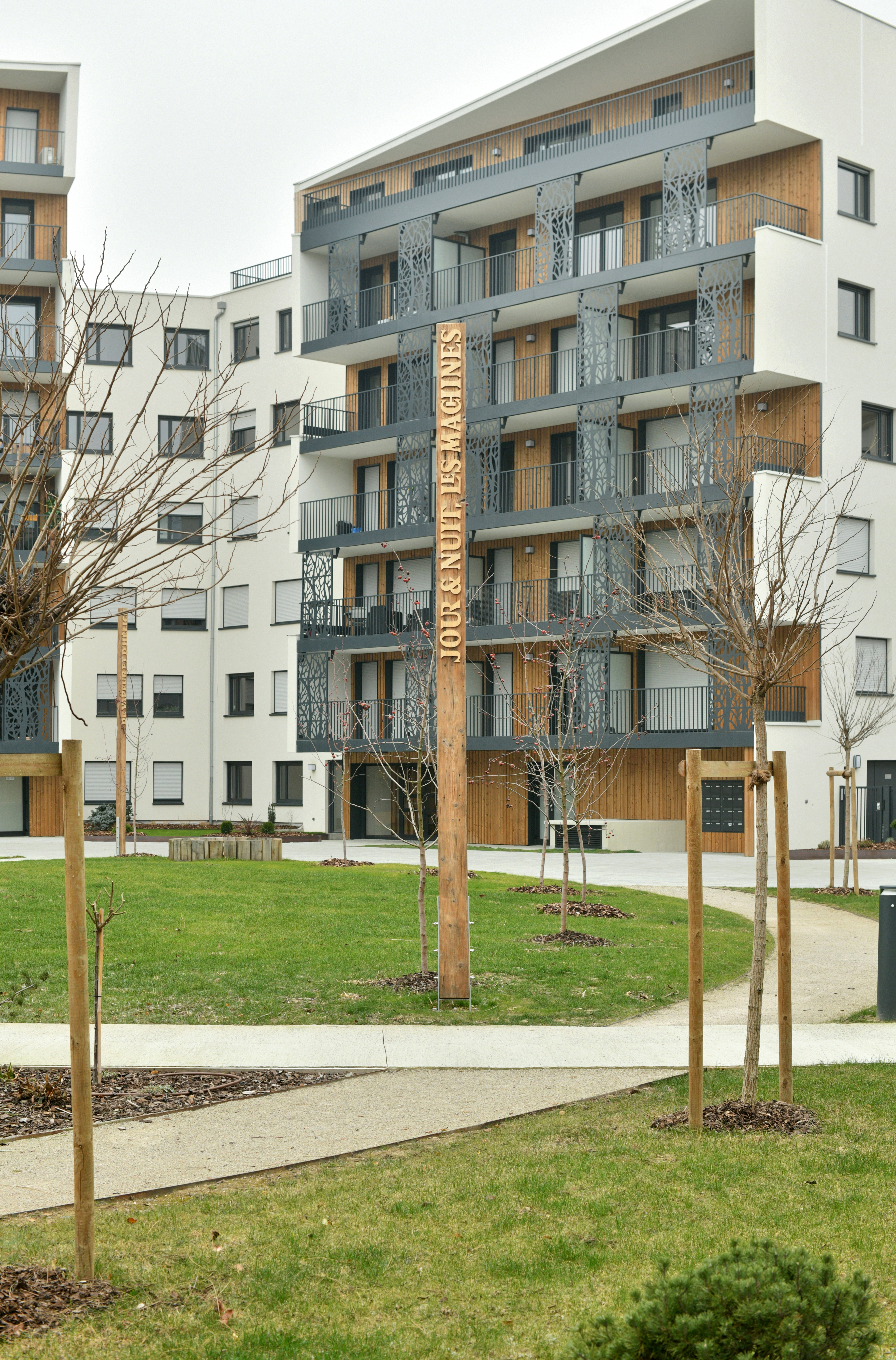
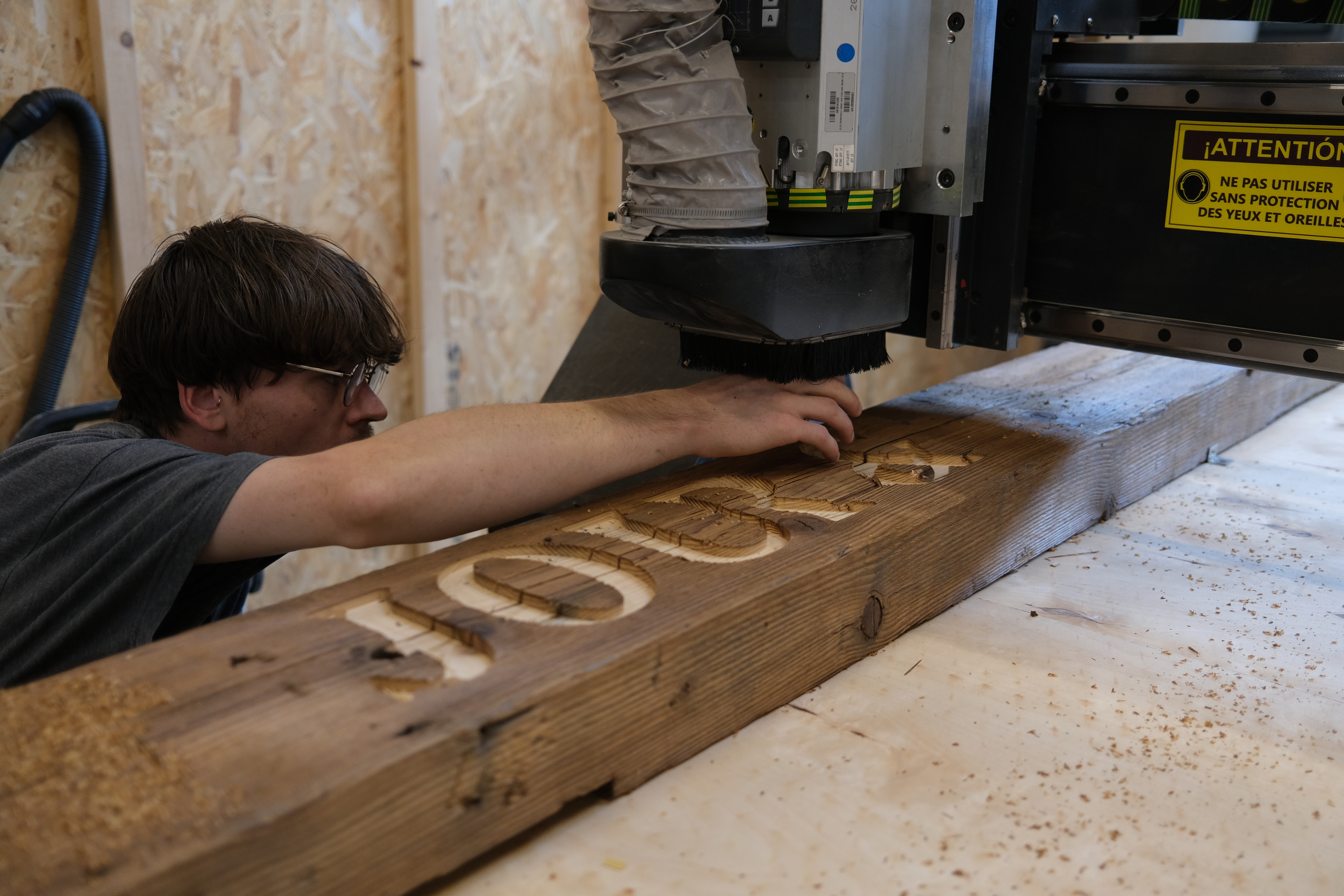
The entire project has been meticulously designed and crafted on-site at the Virgule Coop in Strasbourg, where our studio is located. The wood used for the poles was salvaged from a nearby construction site. These poles were precision-machined using the CNC technology at the Ateliers Éclairés and subsequently assembled and installed by Gris Bois.
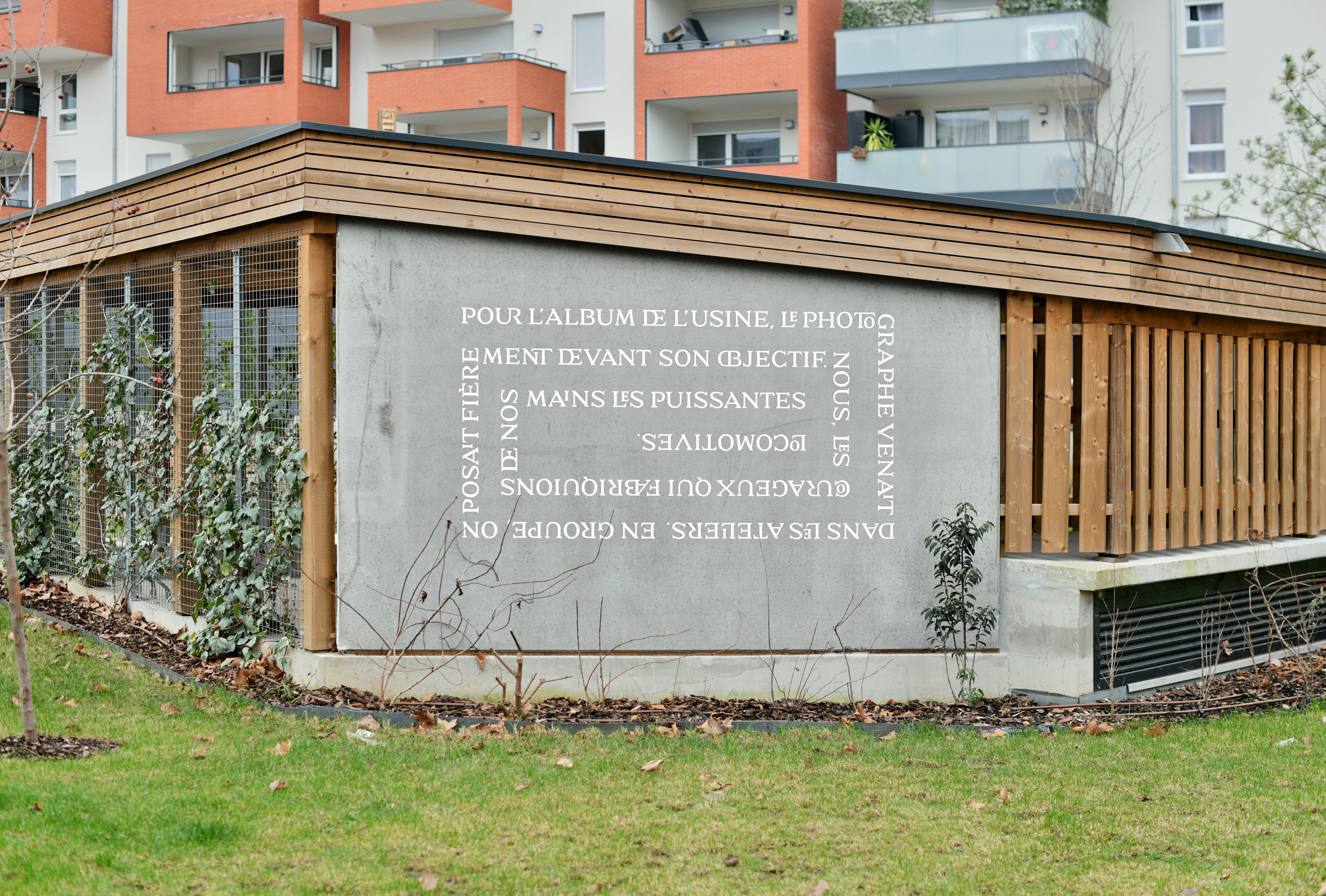
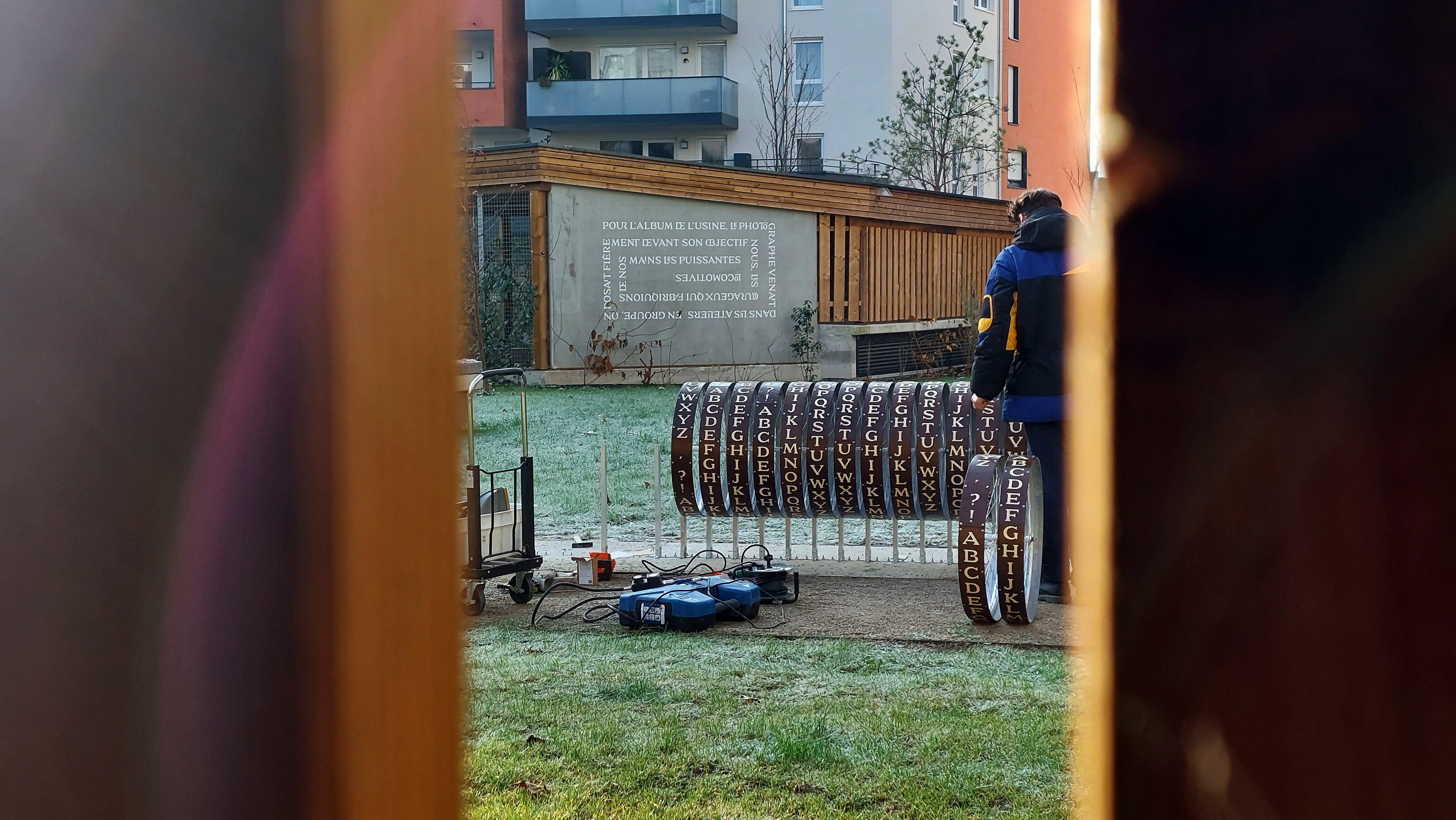
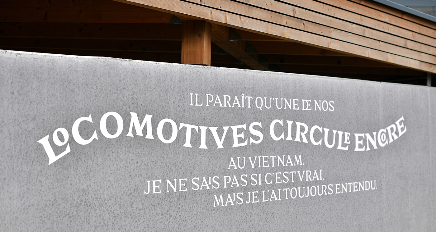
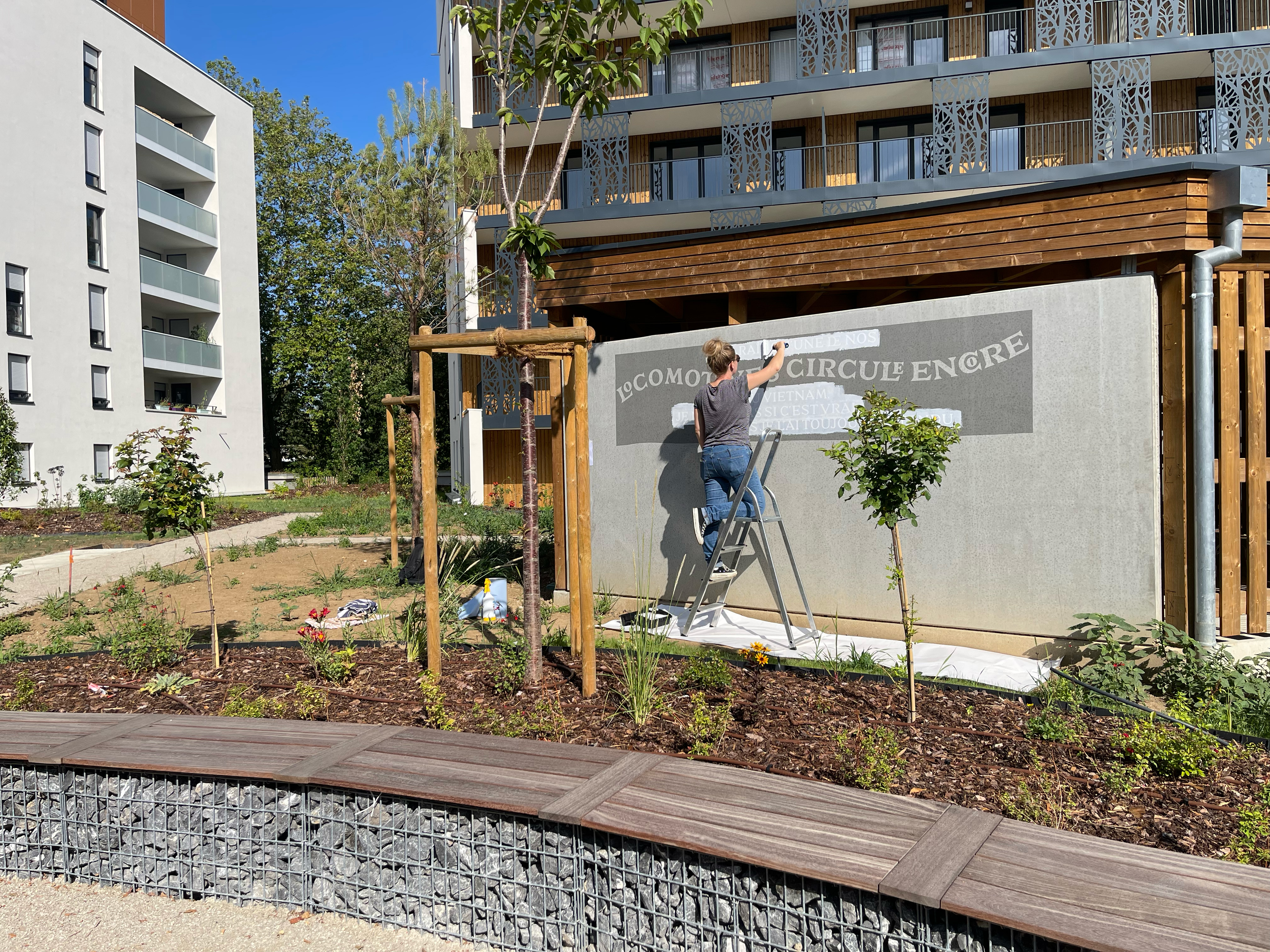
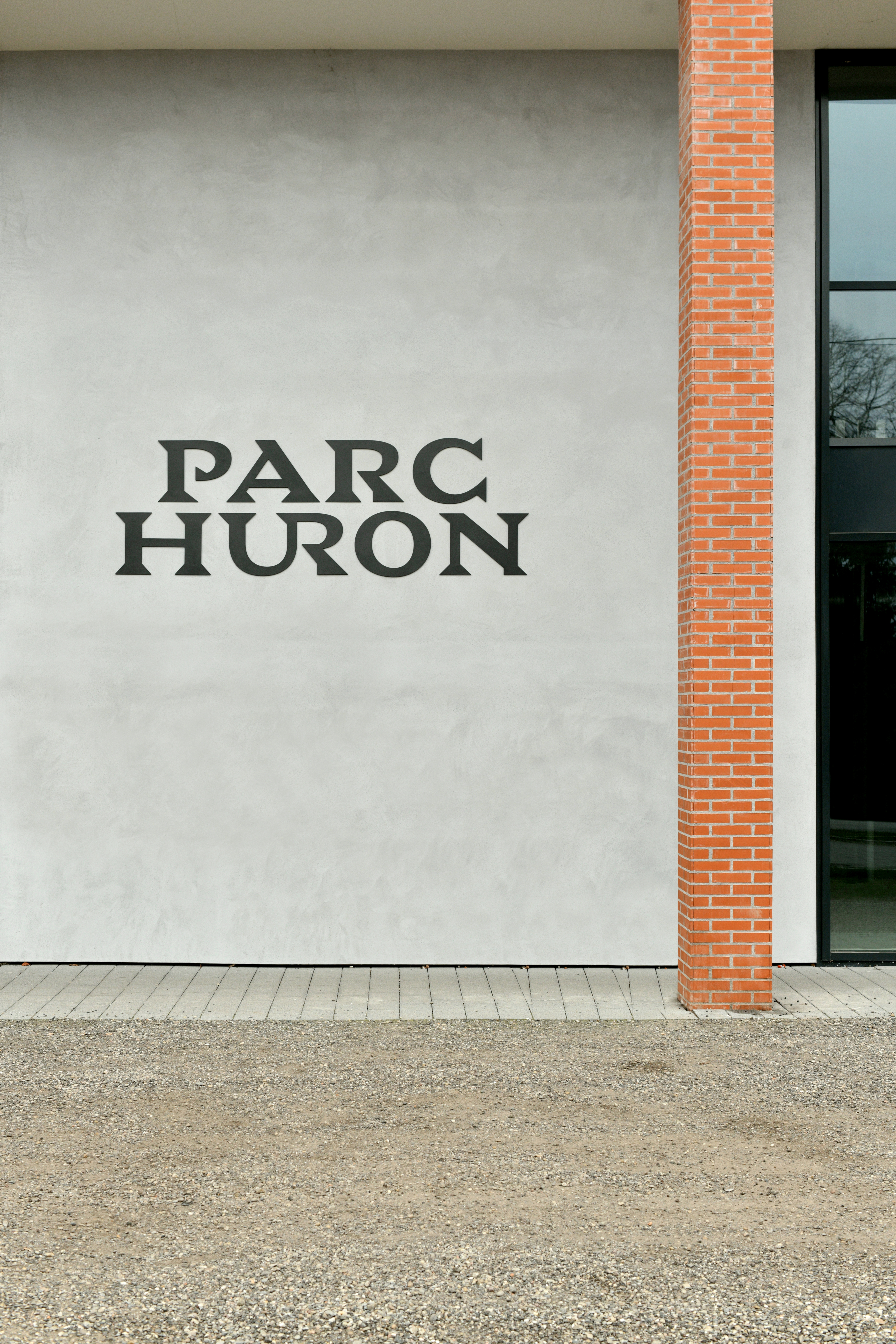
These structures are complemented by wall murals that convey the testimonials of former workers or users of the site, as well as contributions from a giant text typesetter. This ensures that the inhabitants of the place can perpetuate its history through ongoing narrative contributions.
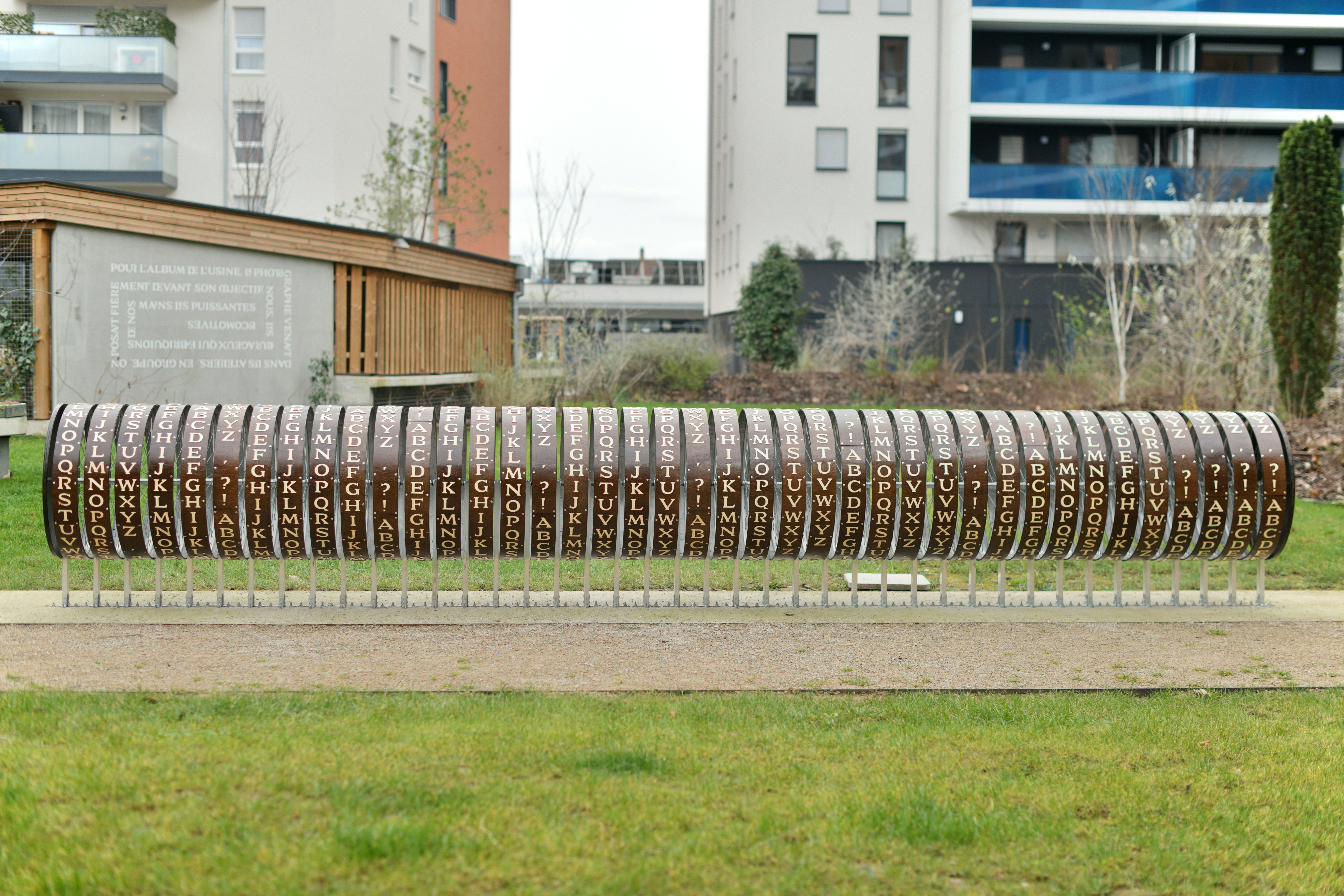
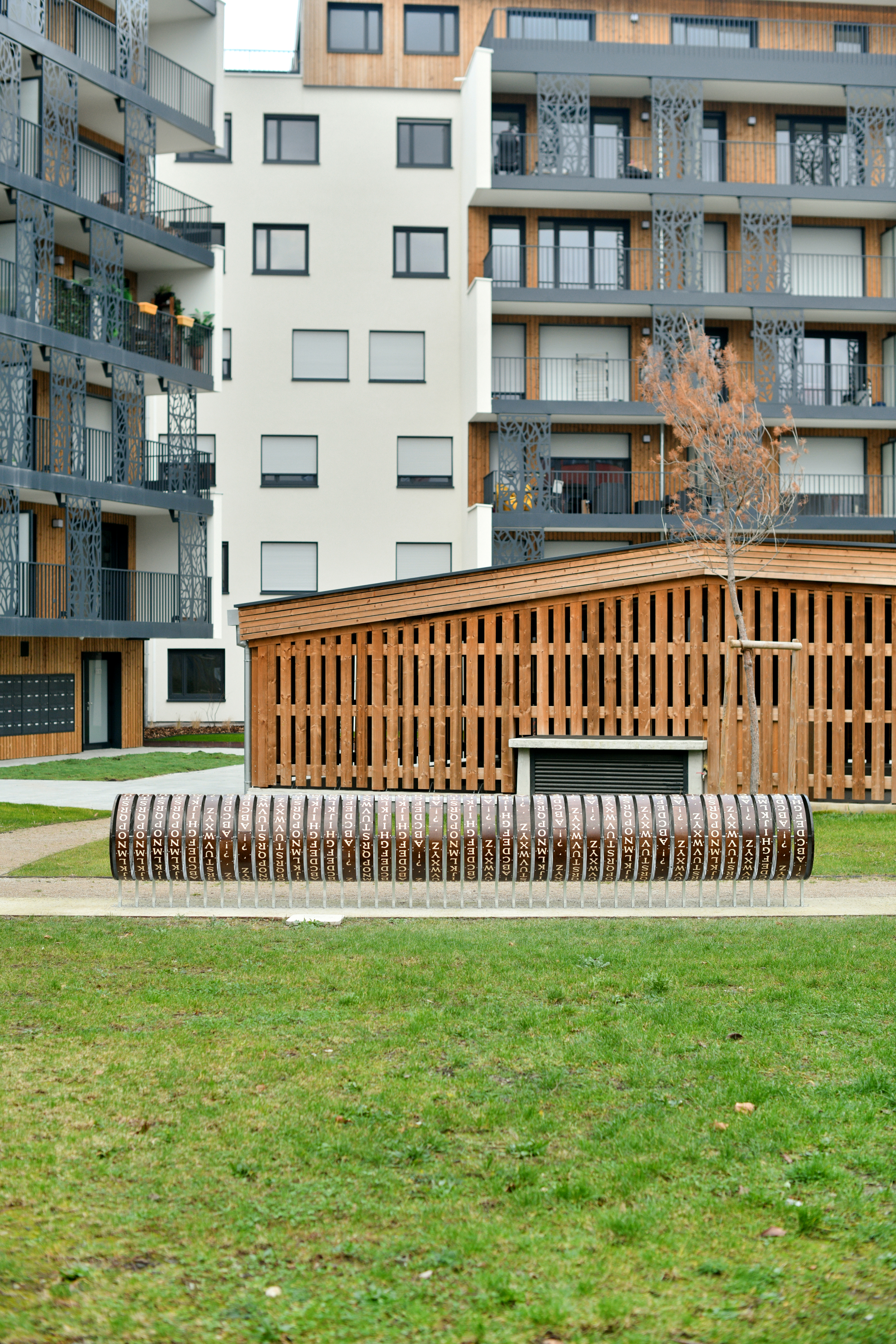
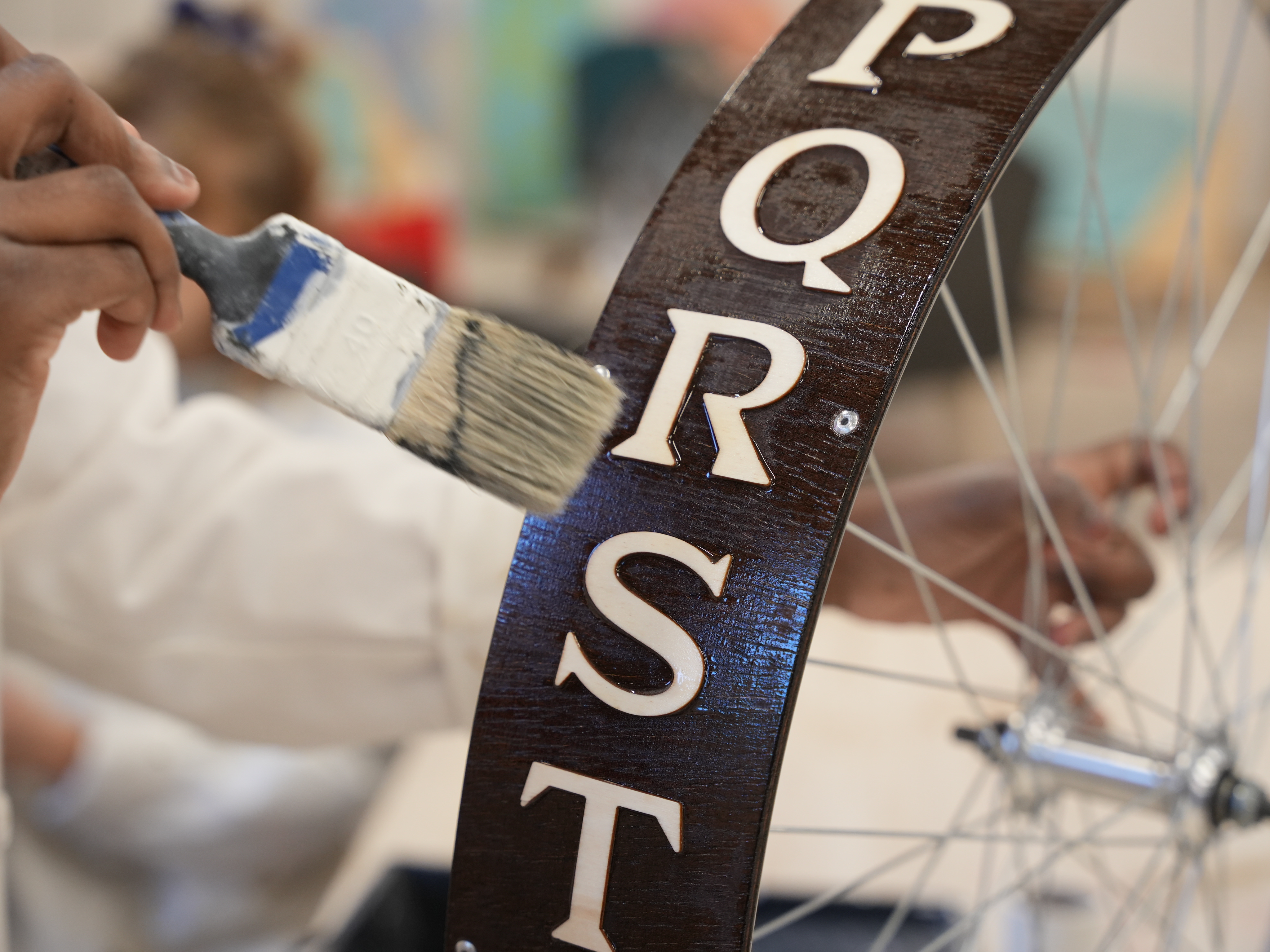
The central oasis within the Huron Park serves as a leisurely haven, an inviting space where residents and local denizens continue to infuse life into their daily surroundings. We have designed a mechanism enabling the writting of concise messages. Crafted day by day by the most inspired individuals, these messages embody the living memory of the project. This type composer, comprising 40 modular units, was conceived and crafted entirely at the Fab-Lab of the Ateliers Éclairés, in collaboration with the designer Thibault Ménoret, using bicycle wheel structures.
The real estate complex stands on the grounds of a once-prominent industrial site in the region—the Huron factory. We were fortunate to delve into the century-old archives of the company, uncovering sources within old documents, technical drawings of locomotives, files, and more. The cover of an aged blueprint album titled "Locomotives" particularly retained our attention.
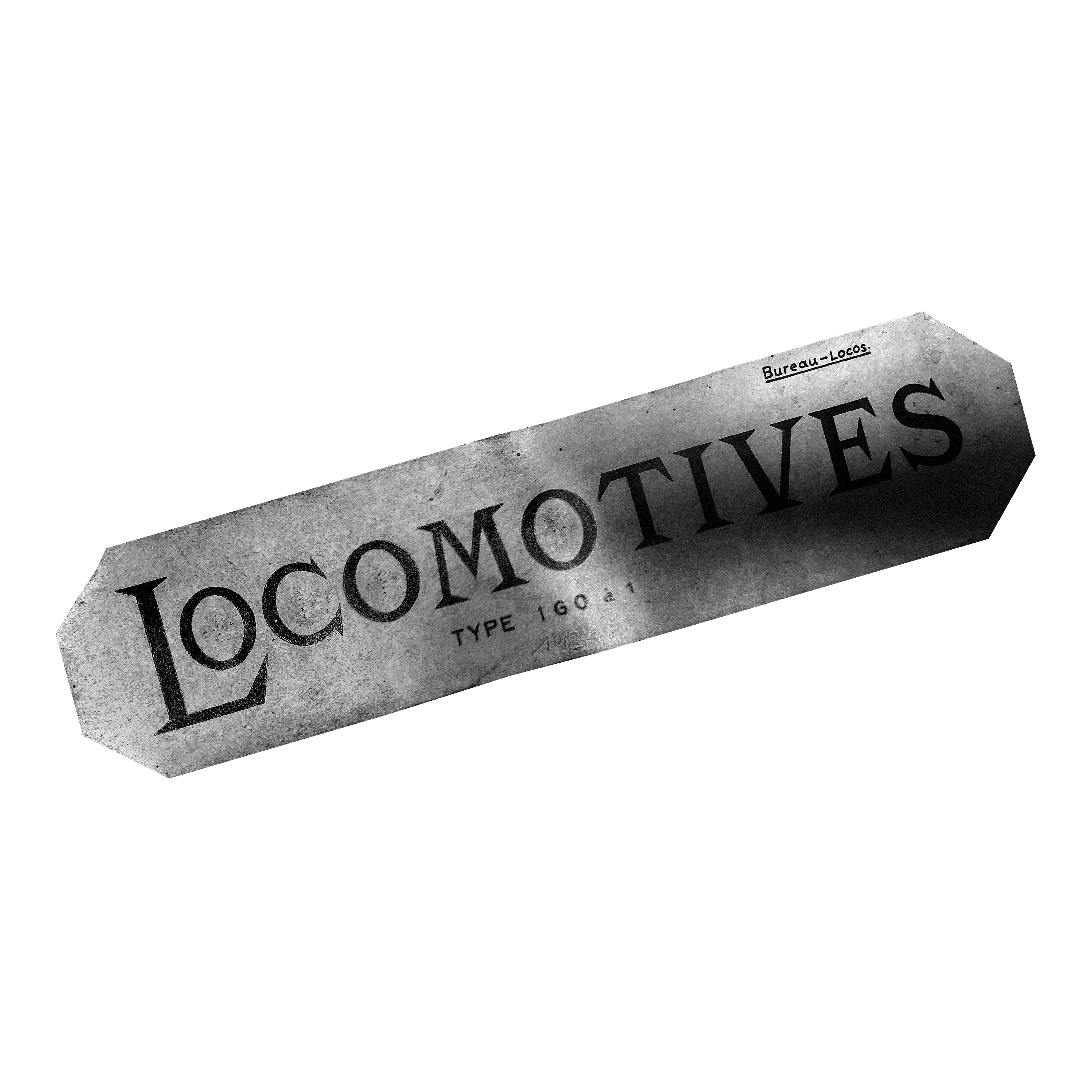
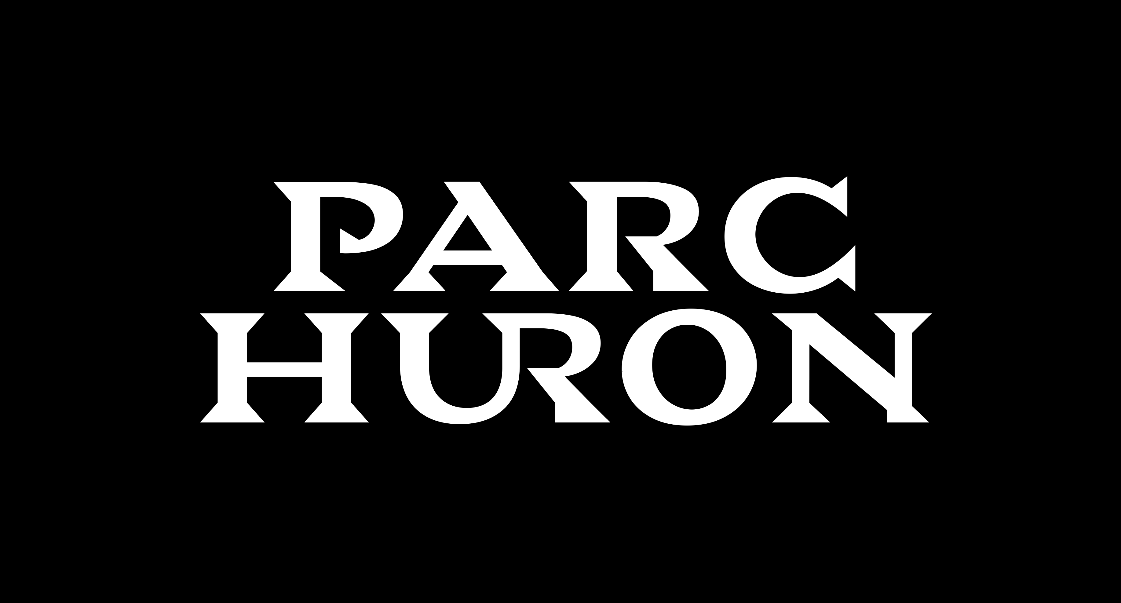
The lines of the typeface draw inspiration from this original lettering, serving as the true starting point to design an entire alphabet with "Huron" as its muse. We experiment with numerous ligatures, where contrasts between the thicks and thins are subtle, while the serifs take on sharp angles.
Designed entirely in uppercase letters, Huron possesses a significant visual impact and graphic strength, serving the artistic project and its objects with distinction.
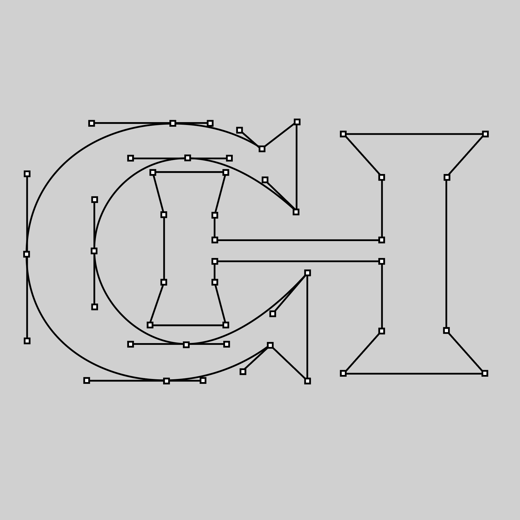
We design and encode a variable font. Its weight and width can adapt to the available space, whether it be on the wall, the pole, or the wheel, while also accommodating the desired graphic impact.
