Culture Grand Est
brand identity
wording
Culture Grand Est is the network of cultural actors in the Grand Est Region. It is under this name that the Grand Est Region communicates with the general public about its cultural policy and the actions it supports. The Region has called upon us to redesign its visual identity to make it more cohesive and visible, especially among cultural professionals.


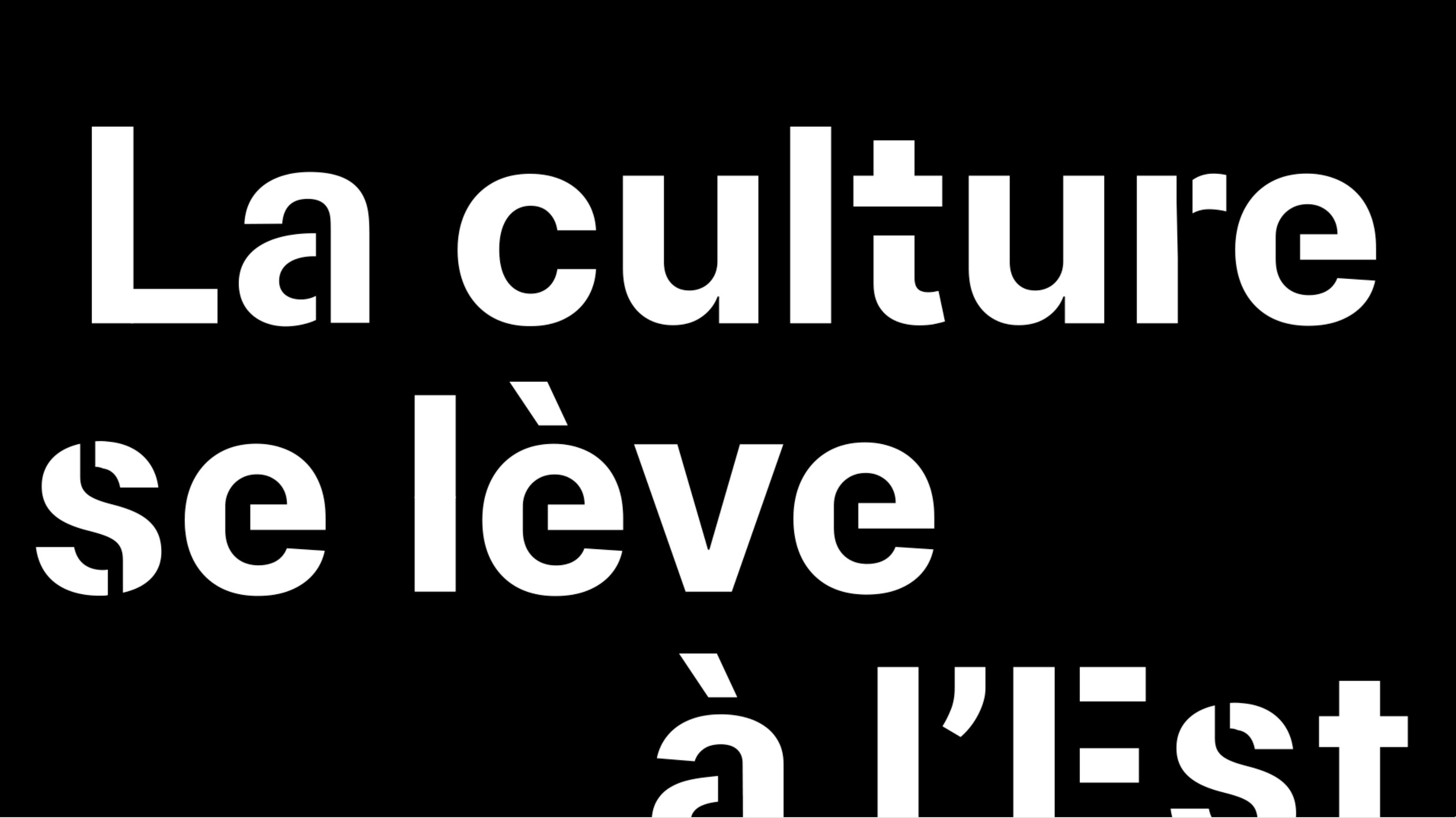
The visual identity is based on the adaptation of an open-source typographic font family. We break down the letters of "Grand Est," echoing the Region's logo. These stencil letters can be used on demand for title compositions.
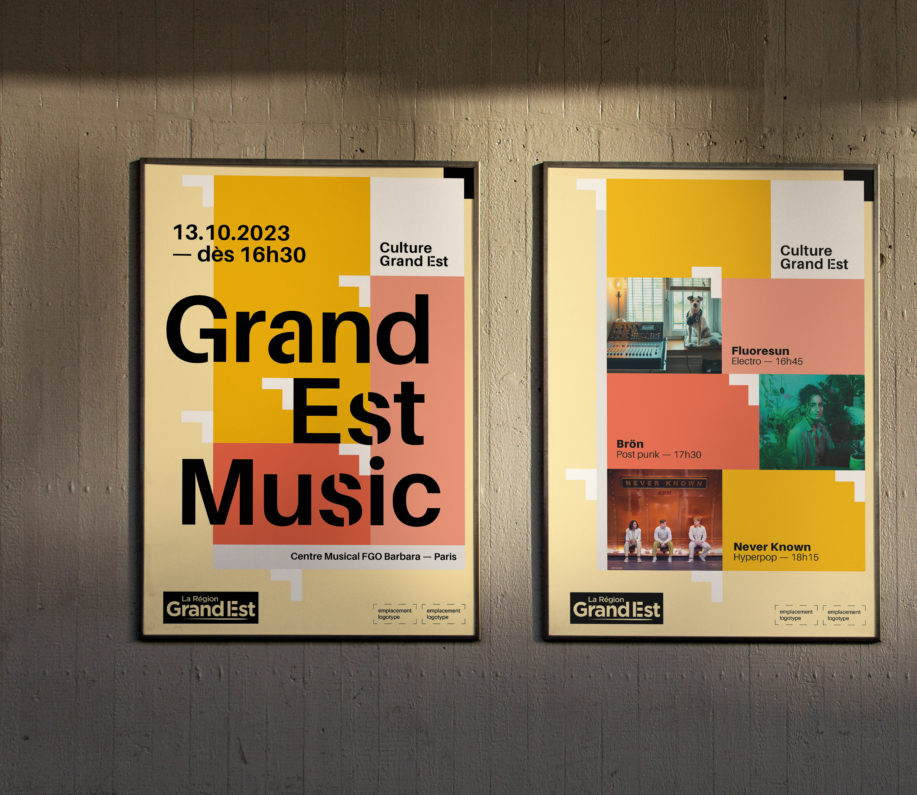
In addition to a strong use of typographic compositions, the visual identity is composed of an arrow consistently placed at the top left corner of the layout. Following that is a typogram placed in a white space, followed by a series of blocks that can accommodate images, texts, and colors. Finally, new arrows placed more freely emphasize the northeast dynamic of the composition.
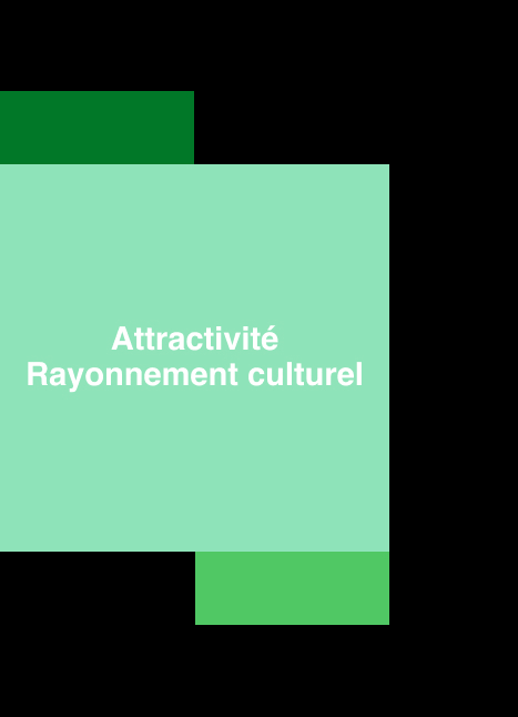

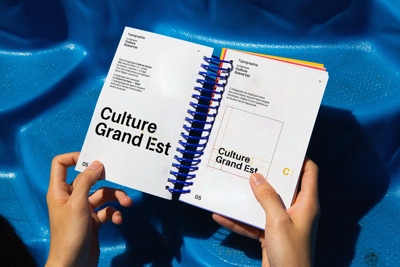
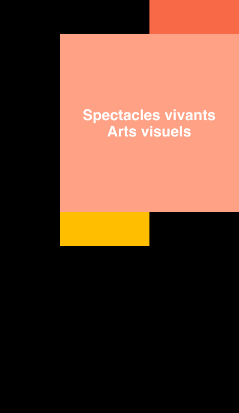
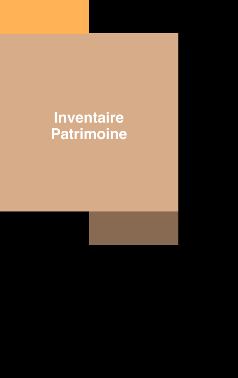
Culture Grand Est is divided into major themes, each equipped with its own dedicated color palette.
A comprehensive visual guideline is developed to allow all the different agents of the Region to create visuals in accordance with the established art direction.
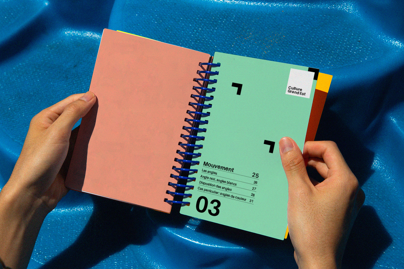

For the composition of generic visuals, a wide variety of color combinations can be created, following specific rules.
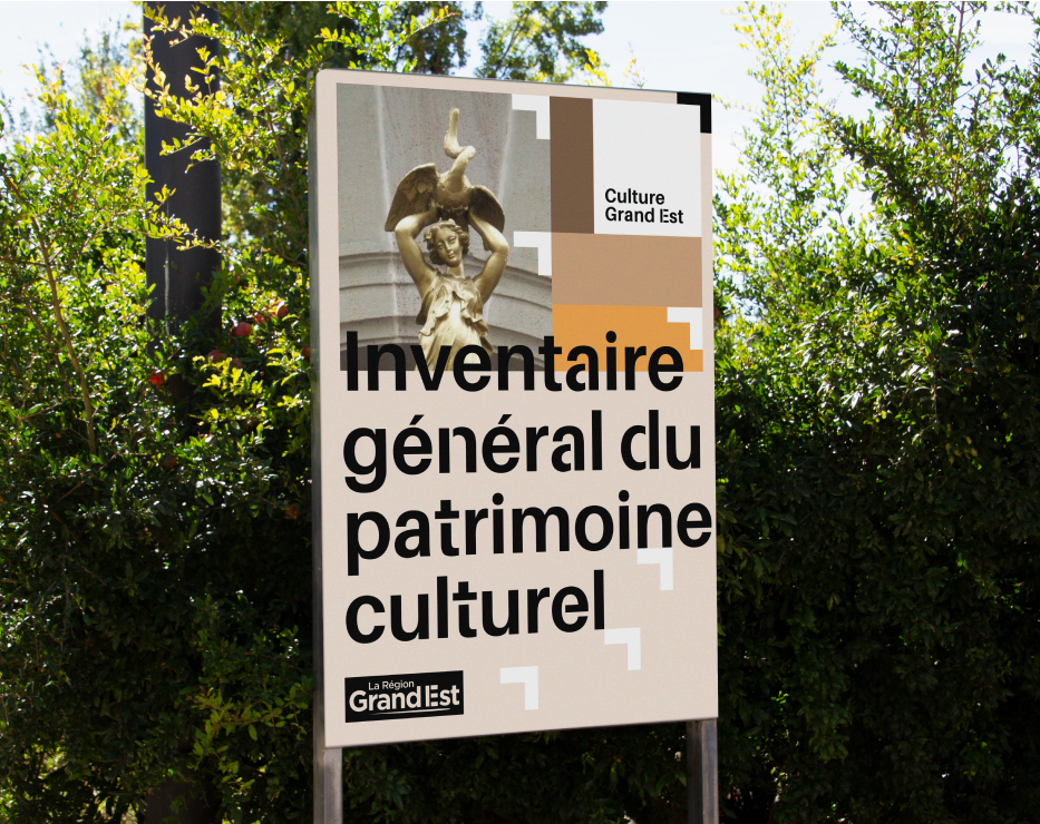
Depending on the desired tone and/or available graphic material, the construction of visuals can prioritize photography, typography, or illustration.


The visuals of Culture Grand Est naturally stem from the northeast angle of the composition.

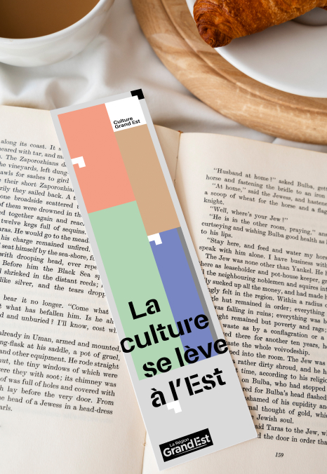
The color blocks form a cohesive ensemble, creating a rectangle that can easily adapt to any format.